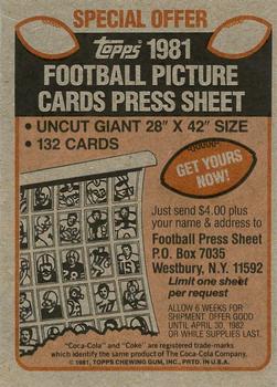
I love uncut sheets of sports cards. They make awesome display pieces, they’re often scarce, they provide set education, finish “master” collections, and provide hobby integrity. So, despite the storage problem, they continue to be really popular. But how did these sheets make their way to the market if cards were meant to be cut up and put in boxes for sale? The conventional wisdom is that they came from Topps employees or out the backdoor of printing facilities. But the reality is a bit more complicated than that, particularly in more modern times, as Topps provided uncut sheets via direct sales, instant winner programs, marketing add-ons, and a few other planned/legitimate means.
You can see the code #945-84 sell sheet for Topps 1984 Uncut Baseball Card Sheets when it comes to direct sales. Topps offered six different sheets of 132 cards (132 * 6 = a complete 792 card set). Topps realized there was a market for uncut sheets and responded as any business would.

One collector on a forum had written that they had bought some sheets in the mid-1980s from local stores (not card stores), and the sheets came wrapped in plastic. So Topps sold some of these, though perhaps not through hobby stores. Another collector responded that as early as 1982, they bought sheets like this from ToysRUs. They were in a large box with the top cut off, left in the aisle for display, and sold for around $6. Others surmise this sales method may have happened as early as 1981
There are also examples of complete boxed sets of 6 uncut sheets of 1987 Topps that are still widely available. Whether they were sold by Topps or a 3rd party is less clear.


Topps also used to provide sheets to collectors through add-ons. In 1989, as the code #325 sell sheet indicates (courtesy of 4192Cards), if any store purchased a case of Bazooka Gum, they got two uncut sheets of Topps baseball cards. It’s believed this happened between 1986 and 1990.

In 1984, OPC inserted instant winner cards into packs, and one of the prizes was the three sheets that made up a complete set.

Earlier in the 1980s, for $4 ($5 in 1982), collectors could receive a full-sized uncut sheet of 1981 or 1982 Topps baseball and 1981 Topps football cards through a promotion with Coca-Cola (through the header card packed with team sets). Many of the sheets the distributor sent to collectors had errors. So, this tactic may have been a way for Topps to make some money rather than throwing away printer errors or allowing staff to walk off with them.


The distributor in Connecticut included an additional offer to get every sheet from 1981 for $4 a sheet or $24 for an entire print run.

There’s another example of acquiring uncut sheets as far back as 1972 for Topps basketball in partnership with Wheaties. The Topps Archives wrote about getting 132 player sheets for $2 plus two Wheaties proof of purchase panels. I’ve included the photos from the Topps Archives blog post below, just in case that site ever goes down and we lose access to its incredible history of articles.


I’m sure there are dozens of more legitimate examples of how Topps distributed uncut sheets of cards in addition to the methods discussed in this post. If you know of any others, share the details in the comments below.
Happy collecting, and don’t forget to check out the Uncut Sheet Archive, too!


