I love uncut sheets of sports cards. They make awesome display pieces, they’re often scarce, they provide set education, finish “master” collections, and provide hobby integrity. So, despite the storage problem, they continue to be really popular. But how did these sheets make their way to the market if cards were meant to be cut up and put in boxes for sale? The conventional wisdom is that they came from Topps employees or out the backdoor of printing facilities. But the reality is a bit more complicated than that, particularly in more modern times, as Topps provided uncut sheets via direct sales, instant winner programs, marketing add-ons, and a few other planned/legitimate means.
You can see the code #945-84 sell sheet for Topps 1984 Uncut Baseball Card Sheets when it comes to direct sales. Topps offered six different sheets of 132 cards (132 * 6 = a complete 792 card set). Topps realized there was a market for uncut sheets and responded as any business would.
1984 Topps Baseball Uncut Card Sheets Sell Sheet
One collector on a forum had written that they had bought some sheets in the mid-1980s from local stores (not card stores), and the sheets came wrapped in plastic. So Topps sold some of these, though perhaps not through hobby stores. Another collector responded that as early as 1982, they bought sheets like this from ToysRUs. They were in a large box with the top cut off, left in the aisle for display, and sold for around $6. Others surmise this sales method may have happened as early as 1981
There are also examples of complete boxed sets of 6 uncut sheets of 1987 Topps that are still widely available. Whether they were sold by Topps or a 3rd party is less clear.
1987 Topps Uncut Sheets Complete Box Set
1987 Topps Uncut Sheets Complete Boxed Set Zoomed In
3 Boxes of 1987 Topps Uncut Sheets Baseball Card Collections
Topps also used to provide sheets to collectors through add-ons. In 1989, as the code #325 sell sheet indicates (courtesy of 4192Cards), if any store purchased a case of Bazooka Gum, they got two uncut sheets of Topps baseball cards. It’s believed this happened between 1986 and 1990.
1989 Topps Uncut Sheet Promotion
In 1984, OPC inserted instant winner cards into packs, and one of the prizes was the three sheets that made up a complete set.
1984 OPC Instant Winner Card
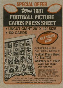
Earlier in the 1980s, for $4 ($5 in 1982), collectors could receive a full-sized uncut sheet of 1981 or 1982 Topps baseball and 1981 Topps football cards through a promotion with Coca-Cola (through the header card packed with team sets). Many of the sheets the distributor sent to collectors had errors. So, this tactic may have been a way for Topps to make some money rather than throwing away printer errors or allowing staff to walk off with them.
1981 Topps Baseball Press Sheet Offer
1981 Topps Football Press Sheet Offer
1982 Topps Baseball Press Sheet Offer
The distributor in Connecticut included an additional offer to get every sheet from 1981 for $4 a sheet or $24 for an entire print run.
1981 Topps Uncut Sheet Offer
There’s another example of acquiring uncut sheets as far back as 1972 for Topps basketball in partnership with Wheaties. The Topps Archives wrote about getting 132 player sheets for $2 plus two Wheaties proof of purchase panels. I’ve included the photos from the Topps Archives blog post below, just in case that site ever goes down and we lose access to its incredible history of articles.
Wheaties Box with 1972 Topps Basketball Uncut Sheet Offer
1972 Topps Basketball Uncut Sheet
I’m sure there are dozens of more legitimate examples of how Topps distributed uncut sheets of cards in addition to the methods discussed in this post. If you know of any others, share the details in the comments below.
Happy collecting, and don’t forget to check out the Uncut Sheet Archive, too!
Mastro offered this 1979 Topps “Baseball Iron-Ons” Test Issue Keith Hernandez promotional piece in their Classic Collector Auctions Catalog in October 2007. After a lot of searching, I can’t find ANYTHING about it online or in The Hobby Library!
Unfortunately, the catalog was intended to augment an online auction, so there weren’t any item descriptions. On the net54Baseball forums, one collector wrote, “Topps would mock these up for internal use, creating Presentation Boards for one kind of pitch or another. Each piece was handmade by the New Product and /or Art Departments. I’ve not run across this one before but it’s pretty awesome.”
If you have any insight into this item or set, please get in touch with me.
I only recently learned about this 1973 Topps-style Joe Garagiola card from the April 1986 issue of Baseball Cards Magazine. They wrote that Joe used it as his business card, but there’s a little more to it than that!
The Topps Archives has a series of posts about the card; the first, from February 2009, identifies it as part of “a small but distinct list of baseball issues from Topps that consist of a single card. The most famous of these is Joe Garagiola’s 1976 NBC Business Card that is a dead ringer for a ’73 Topps baseball card.”
Then, in June 2009, The Topps Archives connected the card to Joe Garagiola’s Bazook Big League Bubble Gum Blowing Championship that gave us the classic 1976 Topps card of Kurt Bevacqua!
And from a photo from the event, The Topps Archives pointed out the uncut sheet behind Joe G., writing, “That, ladies and gentlemen is Garagiola’s ersatz 1973 Topps business card. I think it highly likely said pasteboards were created for him to hand out at this event. The card does have a 1976 copyright on it and I have to think the contest was held after the end of the ’75 season based on the Joe G. card copyright date.”
A pair of articles from the Baseball Hall of Fame explain the competition further. You can also watch the event on YouTube, which originally aired on October 14th, 1975, before Game 3 of the 1975 World Series.
The Topps Archives then shared a few photos of Garagiola’s card as reprinted in 1991.
BaseballCardPedia summarizes the entire story of the card as follows:
Sometime in the mid-1970s, Topps produced for former Cardinals catcher and then-current NBC broadcaster Joe Garagiola a business card done in the style of a baseball card. The front of the card has the design of the 1973 Topps set, while the back is set up like a 1976 Topps card.
It is unknown exactly when this card was produced; however, a framed uncut sheet of the card was seen in the background of a 1975 made-for-TV bubble gum blowing contest hosted by Garagiola for NBC. The contest was sponsored by Topps and was commemorated with a card (#564) of winner Kurt Bevacqua in the 1976 Topps set.
A second run of this card was produced in the early-90s, to coincide with Garagiola’s appointment as co-host of NBC’s Today Show. This card is identical to the 70s card, with the addition of both a Topps and Today Show logo to the front.
However, there’s still one more mystery. You can see up above the back of the variation I shared above has a 1976 copyright and Garagiola’s phone number on the back. There’s another version with a different phone number and 1976 copyright along with the 1991 reprint!
I’ve previously shared Hank Aaron’s 1961 Topps signed check and contract, well, here’s his 1954 Topps Gum Company Check that includes his rookie year signature!
Mastro offered the signed check in its August 2002 Sports & Americana Premier Catalog Auction. Unfortunately the pictures in the catalog are rather small; here’s the back:
And here’s the lots complete description from the catalog:
An official “Topps Chewing Gum Inc.” check that is dated 8/5/54 and made out to “Henry Aaron” in the amount of $10.00. The payment made is for use of Aaron’s image during the 1955 season, but the signature is pure “rookie year” in appearance. On the reverse is the “Henry Aaron” signature, as well as the printed agreement between Topps and Aaron for the rights to use his image for the 1955 cards. Although fully readable, the signature is affected by the check’s fold and by several cancellation stampings. LOA from Mike Gutierrez/MastroNet.
PS, another cool Topps check I’ve shared is Bill Russell’s 1957-58 Topps basketball card canceled paycheck.
While researching 1978 Topps Burger King sets for my recent series about Topps baseball sets that year, I stumbled upon something interesting in The Standard Catalog – the vintage Cincinnati Reds Burger Beer sets (Burger King next to Burger Beer). However, there’s surprisingly little information available about them, and confusion surrounds their origin and purpose since some of them aren’t marked to an issuer. Here’s what I’ve been able to dig up.
The Cincinnati Reds Burger Beer Sets in the Macro
My 2010 Catalog lists five different Burger Beer sets: 1952-53, 1955, 1956-57, 1958-59, and 1960-64. I then found that Bob Lemke debuted a 1954 release on his blog. In that post, he shared that a few Reds’ specialists helped him develop the set’s checklists and that the cards are sort of arbitrarily assigned to various “sets” based on shared photo characteristics and the uniform worn by the player; he acknowledges that more than one style of picture may have been produced in any given season since no one seems to recall the manner of distribution.
However, all the Burger Beer premiums share a similar format. While they vary in size a bit, they all have portraits or posed action black-and-white photos on the front with white borders—usually some combination of name, position, team, and logo. The backs are generally blank, besides the few issues with an advertising message at the bottom.
I want to categorize and discuss these sets based on that advertising. Those referencing Burger Beer on them include 1954, 1956-57, and 1958-59, and those that don’t and are cursorily related are 1952-53, 1955, and 1960-64.
Burger Beer Sets With a Reference to an Issuer
It’s been really tough to find examples of these cards and then commit them to specific years, so if you have any corrections or additional photos, please let me know in the comments or shoot me an e-mail.
1954 Burger Beer Cincinnati Reds
1954 Burger Beer Cincinnati Reds – Charley Harmon and Jim Greengrass
The distinguishing characteristic of cards attributed to 1954 is the appearance of an advertising message, “Courtesy of Burger Brewing Co.” That message can be on the front or the back of the 8-1/2″ x 11″ picture cards. On his blog post, Lemke included Bobby Adams, Fred Baczewski, Dick Bartell (coach), Bob Borkowski, Jim Greengrass, Charley Harmon, Waite Hoyt (announcer), Andy Serminick, and Birdie Tebbetts (manager) to the checklist but acknowledged that more pictures would likely be reported.
1956-57 Burger Beer Cincinnati Reds
1956-57 Burger Beer Cincinnati Reds – Frank Robinson
The 1956-57 Burger Beer series also featured 8-1/2″ x 11″ and black and white player photos. The player’s names are printed in all capital letters under the image on the white border. A unique advertising slogan at the bottom of the otherwise blank back distinguishes these cards: they say, “COURTESY OF BURGER – A FINER BEER YEAR AFTER YEAR.” Cards of the same player in both portrait and posed action photos exist. I believe the checklist is at 27 right now. Lemke wrote that the existence of ad lines raises the chance that the issues without one might not have any connection with Burger Beer, but they’re accepted as such by a lot of Reds collectors because of their similarity to those that do.
1958-59 Burger Beer Cincinnati Reds
1958-59 Burger Beer Cincinnati Reds – Frank Robinson
The 1958-59 Burger Beer Reds cards have been the easiest for me to track down examples of. They’re also 8-1/2″ x 11″ with black and white player photos, but they can be distinguished by another unique advertising slogan on the backs, “COURTESY OF SPARKLE * BREWED BURGER BEER / HAVE FUN – HAVE A BURGER.” Examples exist with the player’s name on the front with both their first and last name or last name only. Lemke wrote that some have the team name, too. The current checklist has 17 pictures of 13 players.
1958-59 Burger Beer Cincinnati Reds – Waite Hoyt
Burger Beer Sets Without a Reference to an Issuer
Lemke acknowledged that there’s a chance these sets have nothing to do with Burger Beer, so what else could they be? Well, there were many team-issued postcards during this time (search for Cincinnati Redlegs sets on TCDB, and you’ll get dozens of returns), so it’s possible the team also released cards at stadium concession stands in different formats. I also thought they could have been Jay Publishing sets, but I think most of these are 5″ x 7″ in size, and the Burger Beer issues are sized more like a standard sheet of paper, ideal for player signings. Ultimately, however, no one seems to know, so categorizing them as non-referenced Burger Beer sets works for me!
1952-1953 Burger Beer Cincinnati Reds
As I said, whether these cards were a Burger Beer promotion or not, Reds collectors ascribe them to that sponsor. I haven’t found a photo beyond the one in The Standard Catalog, but the blank-backed photos have player portraits or posed action shots within a white border. On the bottom border is a C Reds logo, with the player’s name and position (usually) in all capital letters to the right. The cards are 8″ x 10-1/2″, and the checklist stands at 12.
1955 Burger Beer Cincinnati Reds
1955 Burger Beer Cincinnati Reds – Ed Bailey
The 1955 Burger Beer Cincinnati Reds cards are 8 1/2″ x 11″ and again feature black-and-white player pictures with white borders. So again, since they have a similar format, collectors attribute the set to Burger Beer. On the bottom border are team logos of Mr. Red on either side of the player’s name, position, and sometimes team – the backs are blank. I’ve also seen these cards described as being 8″ x 10″.
1955 Burger Beer Cincinnati Reds – Charlie Harmon
Lemke followed up his post about the 1954 Burger Beer cards with an article two days later expanding the 1955 Burger Beer checklist. He wrote that he thought the ’55s were the most visually appealing of the bunch, with the Mr. Red baseball logo in each corner of the wide bottom border. He acknowledge the style of picture could have begun in 1954 and continued into 1955 since two of the known pictures in this format are of players who were traded away from the Reds in the 1954 postseason. Lemke expanded the checklist from 13 to 22 cards:
(1) Bobby Adams
(2) Dr. Wayne Anderson (trainer)
(3) Fred Baczewski
(4) Ed Bailey
(5) Gus Bell
(6) Rocky Bridges
(7) Jackie Collum
(8) Art Fowler
(9) Jim Greengrass
(10) Charlie Harmon
(11) Ray Jablonski
(12) Johnny Klippstein
(13) Ted Kluszewski
(14) Roy McMillan
(15) Rudy Minarcin
(16) Joe Nuxhall
(17) Harry Perkowski (traded to Cubs, Oct. 1, 1954)
(18) Wally Post
(19) Frank Smith (traded to Cubs, Dec. 8, 1954)
(20) Gerry Staley
(21) Birdie Tebbetts
(22) Johnny Temple
1955 Burger Beer Cincinnati Reds – Roy McMillan
1960-64 Burger Beer Cincinnati Reds
1960-64 Burger Beer Cincinnati Reds – Joey Jay
This series is the most suspect to me; with so many acknowledged variations, it’s hard to believe they were all associated with Burger Beer. But they share the same large (8-1/2″ x 11″) format with white borders. Many of the photos were reissued year after year with cropping changes and aren’t usually listed separately in the checklist, so any checklist is likely incomplete and only grouped based on format. Lemke wrote that they all have two lines of type on the front, the player’s name and team, with blank backs. Some players have up to six different poses. He also noted that it might be feasible for a dedicated Reds collector, who has all the cards or photos, to break the set down into its component parts based on player selection and uniform to date them. A decade ago, the checklist stood at 57 player/pose combinations.
Conclusion and Further Reading
In 2013, Sports Collectors Daily got access to the following Roy McMillan card, wearing a uniform dated to 1951, and asked if perhaps Burger Beer issued a full 1951 Reds photo set as well – hey, at least this one has the Burger Brewing Company text on it.
Maybe a 1951 Burger Beer Cincinnati Reds – Roy McMillan
However, we’re unlikely ever to know if Burger Beer sponsored all of these sets. They’re still pretty awesome collectibles, though, particularly if you’re a fan of all-time greats like Joe Adcock, Ted Kluszewski, Joe Nuxhall, Smokey Burgess, Frank Robinson, Don Newcombe, Vada Pinson, or even Pete Rose (he has a portrait to chest card associated with the 1960-64 issue).
A blast from auction history past: In October 2007, Mastro, via his Classic Collector Auctions, offered this incredible 1938 R83A Gum, Inc., Long Ranger Premiums Store Advertising Promo Sheet.
Unfortunately, the catalogs for these “internet-only” auction events from Mastro Auctions didn’t include an item description. However, several promo sheets have been auctioned off over the years. For example, REA sold a lot of three of them for $420 in the spring of 2015.
Here’s what they wrote about them:
Extremely rare collection of three advertising sheets, issued by Gum, Inc., in 1938, promoting the company’s “Lone Ranger” premium cards (R83A). The front of each 8 x 10-inch paper flyer pictures a montage of all five premium cards offered, while the reverse provides complete instructions for boys and girls on how to obtain them (it involved buying a lot of “Lone Ranger” Bubble Gum!). As noted on the reverse, the premium cards depict scenes from Republic Pictures’ The Lone Ranger, thus promoting the movie serial as well. While nearly all collectors are familiar with the actual premium cards, this promotional flyer is seldom encountered and is a perfect complement to any advanced R83A collection. In many ways, it represents a “sixth premium” to the set. The reason for its rarity today is obviously related to its purpose (it is an advertising piece) and limited distribution, as well as its extremely fragile nature. Printed on thin paper stock, few survived the rough handling they endured at the hands of young children as they ran from the candy store to show their parents exactly why they needed more money for “Lone Ranger” Bubble Gum. Parents too were probably quick to toss them in the trash as soon as their son’s or daughter’s interest shifted to the next “must have” premium. The offered advertising sheets were recently discovered by our consignor at a garage sale. (The entire find consisted of five examples, the other two of which were sold in REA’s fall 2014 auction.) The three advertising sheets are in Excellent condition overall, displaying only very tiny touches of wear at the corners and no creases or heavy wrinkles. This is a very rare collection of three desirable advertising pieces relating to this popular series of premiums!
As for the five-card premium set, which together can sell for well over $1k, James Watson, in his fantastic Non-Sports Bible, wrote that the set was “actually issued prior to Gum, Inc. card set, these premiums contain artwork that is not reproduced on any of the regular issue R83 cards. Attractive artwork is one attribute that certainly contributes to their popularity. The majority of premium #1 contain the hero’s mask ‘drawn in by hand,’ but is absent in this original variation. This set was originally listed as R83A in the American Card Catalog.”
Happy Collecting!
PS, here’s a larger scan so you can read the back!
Here’s a cool piece from days of auctions past: a 1974 Topps Deckle Edge Proofs complete set of 72. MastroNet offered it in their 2nd Classic Collector Auctions in February 2005.
Individual proof samples are pricey these days; here are a few recent graded sales from eBay:
Johnny Bench – $506.95 in December 2024
Steve Carlton – $240 in December 2024
Jim Palmer – $900 in November 2024
The set itself was a test issue with limited distribution in the Massachusetts area. These proofs are known with white or gray backs, and they’re slightly larger than the final deckled cards that were released three per pack for five cents with gum or in two-card packs with no gum.