Welcome to the relaunched Unopened Archive! It used to have pages with photos of packs, wrappers, boxes, and cases from all the big pre- and post-war releases. This 2.0 version is more of a hub for all my blog posts about different unopened material. Over time, I’ll bring back the old content and add way more—like info about fakes, finds, sales, collation, and all the known products out there.
Some of my most unique unopened writing is released via the paid tier of my newsletter, The Unopened Market Report, but if you’re looking for a particular unopened product photo, shoot me an e-mail.
T.S. O’Connell wrote an excellent article for Sports Cards Magazines’ April 1995 issue about World Series Cards; these were his Top 10. What do you think about the list?
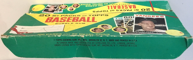
My favorite thing about the hobby is interacting with other collectors and hobby historians and learning about new items. Well, on the morning of May 1st, 2023, a collector contacted me via e-mail after perusing the site with two photos of an empty box of cards I’d never seen before.
1964 Topps Baseball Gift Box
1964 Topps Baseball Gift Box Lid
He thought maybe they were issued around Christmas time in 1964 to sell leftover cards after the season had ended and asked if I knew anything about it. I searched some of my older books and came up empty-handed. He mentioned the box didn’t have any code on it, so I asked if he’d be ok with my sharing it on Facebook to see if anyone else could help.
On Facebook, a collector mentioned he had seen a reference to the box before and shared the following sell sheet.
1964 Topps Baseball Gift Box Sell Sheet
One collector on Facebook commented that the box on the sell sheet looks a lot like a carton of cigarettes! And another was pretty sure Topps only made this product in 64.
The box wasn’t really meant for Christmas; it’s a gift box for any occasion, “what better way to say ‘happy birthday’ or just ‘hello.’ The boxes came 24 per case for $14.40 or 60 cents a box. Each box had 20 5-cent packs (100 total cards), though given the gift theme, I don’t think they were meant to be sold by the pack.
A ton of collectors reached out to me asking if the owner was interested in selling the empty box, but he’s not. Given how much interest it garnered in such a short period, I presume bidding would be intense.
I’m unsure how you’d price such an item, though. However, one collector shared that there was one on eBay many years ago, and he thought it was for $500, or maybe $338, but acknowledged it would go for much more these days. Another collector thinks he saw one around 2004.
The owner later shared three more photos of the box with me.
1964 Topps Baseball Gift Box – Angle 1
1964 Topps Baseball Gift Box – Angle 2
1964 Topps Baseball Gift Box – Angle 3
An interesting thing about the box is that that’s not Whitey Ford’s 1964 Topps baseball card printed on it; it looks like a 1964 design, but with his 1963 Topps photo.
1964 and 1963 Topps Whitey Ford Cards
Some collectors surmised it could have come out as early as December 1963, given the difference in Ford’s card design. And maybe the low item number of 400 (on the sell sheet) indicates an early release, along with the image of the smiling kid being the same as the one on the 1962 Topps Baseball Bucks dealer sell sheet?
1962 Topps Baseball Bucks Sell Sheet
Funny enough, Topps did something similar with the 1964 Topps Giants set; the picture of Whitey Ford on the box isn’t identical to his card.
1964 Topps Giants Box and Whitey Ford Card
If you have more insight into this unique Topps product, please leave a comment or e-mail me.
In 2005, Sotheby’s offered a collection of some of the scarcest Pacific Coast League cards in their “Important Sports Memorabilia and Cards” auction. The lot included 136 cards, plus a few original mailing envelopes, of the four Centennial Flour’s Seattle Rainiers sets issued between 1943 and 1947.
Here’s the lot’s description:
Produced by Centennial Flouring Mills this scarce regional consists of four sets of unnumbered cards featuring only players from the Seattle Rainiers. Includes the following: 1943-Complete Set of 25 mostly NM, 1944 Complete Set of 25 mostly NM/NM+ with original mailing envelope, 1945 Complete Blue Tint Set of 27 all but a couple NM, 1945 Complete Black & White Set of 27 EX-MT to NM but for 1/3 having a water stain in the corner (includes original mailing envelope), 1947 Complete Set of 32 mostly NM/NM+ (includes original mailing envelope).
I hadn’t even been tracking that the 1945 set had both black & white and blue tint variations.
Here’s how you can tell each of the sets apart.
The 1943 cards are 4” x 5”. The bottom of the card backs read “Compliments of / CENTENNIAL FLOURING MILLS.”
The 1944s say, “Compliments of / CENTENNIAL HOTCAKE AND WAFFLE FLOUR.” on the back.
The 1945s are slightly narrow but longer than the two previous releases. They have a borderless photo on the front and the name and team printed in a black bar at the bottom.
The 1947s share the exact dimensions of the ’45s but have a white-framed box with the player’s bio on the back.
Heritage sold a collection of all five of these complete sets (both 1945 variations) in April 2010 for $3,107.
The early 1990s have a nostalgic place in my collecting soul since I stopped collecting cards somewhere around 1997 before returning to the hobby as an adult. Today, my collecting and hobby interest is focused more on post-war vintage vs. this late “junk” era, but there are some important cards from this time. Some stand out to me today because I remember their popularity at the time, others because of today’s market prices, and others just because of the player’s career performance. No matter the reason, here are 18 early 1990s baseball cards that came to my mind that you might be interested in adding to your collection.
1990 Leaf #300 Frank Thomas
1990 Leaf #300 Frank Thomas
At its release, all the kids in my neighborhood wanted to get these Leaf cards, which we treated as a premium release at the time. I think I focus on the Frank Thomas card from this set today because our family had moved to Chicago, and he became the decade’s premier player.
1990 Score #697 Bo Jackson
1990 Score #697 Bo Jackson
Bo Jackson’s accolades across multiple sports led him to be considered one of the best athletes of all time. He was incredibly popular in the hobby, and this photo is simply iconic.
1990 Topps #414 Frank Thomas
1990 Topps #414 Frank Thomas
I think I focus on this card more as an adult because of what I said earlier about Frank’s performance on the field, and as a hobby historian today, the story of the No Name on Front card brings a lot of attention to 1990 Topps as a set.
1990 Topps #414 Frank Thomas No Name on Front
1990 Topps #414 Frank Thomas No Name on Front
The No Name on Front 1990 Topps Frank Thomas card is a bucket list card for a ton of collectors.
1990 Topps #USA1 George Bush
1990 Topps #USA1 George Bush
We now believe there are two versions of this card: glossy-coated cards that Topps gave to President Bush and ones without the coating that Topps probably didn’t intend for public release. Cards were peaking at this time, so the card got a lot of attention, and it still demands incredible prices today.
1991 Topps #333 Chipper Jones
1991 Topps #333 Chipper Jones
Chipper didn’t play much until 1995, so I think my inclusion of this card is based on the popularity of the 1991 Chipper Jones cards today and my memories of watching every Braves game on TV.
1991 Upper Deck #SP1 Michael Jordan
1991 Upper Deck #SP1 Michael Jordan
I mean…yeah, of course.
1991 Upper Deck #SP2 Ryan/Henderson
1991 Upper Deck #SP2 Ryan/Henderson
Upper Deck did a great job making exciting cards, and this Nolan Ryan and Rickey Henderson card captured a fantastic day in baseball history.
1992 Bowman #302 Mariano Rivera
1992 Bowman #302 Mariano Rivera
1992 Bowman was super popular when it was released, but the Rivera card being on this list is more a result of his career accolades than my younger collecting journeys.
1992 Donruss Elite Cal Ripken Jr.
1992 Donruss Elite Cal Ripken Jr.
I’ve written a lot about Cal Ripken Jr. in the past; add this one to the bucket list.
1992 Fleer #712 Frank Thomas
1992 Fleer #712 Frank Thomas
If you collected cards during the junk era, you absolutely knew about this card.
1992 Fleer Update #U-92 Mike Piazza
1992 Fleer Update #U-92 Mike Piazza
I’ve included the Fleer Update Piazza rookie card on this list due to its popularity today, which is in a tight race with his 1992 Bowman card. But I think, as kids, we all preferred his 1992 Topps Stadium Club card.
1992 Upper Deck #SP3 Deion Sanders
1992 Upper Deck #SP3 Deion Sanders
Another multi-sport superstar, Deion Sanders was a high performer on two fields and has continued to be relevant in sports as a commentator, public figure, and coach. Upper Deck did a great job on this 1992 Upper Deck card, blending football and baseball together.
1993 SP #279 Derek Jeter
1993 SP #279 Derek Jeter
Today, this is Jeter’s most desirable rookie card, and high-grade variants dwarf most sales of cards from this era.
1993 Topps #98 Derek Jeter
1993 Topps #98 Derek Jeter
Derek Jeter is one of the most popular baseball players of all time, and Topps is the most celebrated brand, so I feel like this card has to be included on any list of great 1990s baseball cards, though I prefer his Pinnacle rookie card.
1994 SP #15 Alex Rodriguez Foil Die-Cut
1994 SP #15 Alex Rodriguez Foil Die-Cut
Alex Rodriguez was a monster when he came into the majors, and this card was a beast when it first came on the market and was a quick addition to many top 100 baseball cards of all-time lists.
1994 Upper Deck Mantle/Griffey Jr. Autograph
1994 Upper Deck Mantle/Griffey Jr. Autograph
In the days before there were more inserts and specialty cards in sets than base cards, any insert/chase was popular. I think this card may be underrated (despite high prices) when you couple Mantle and Griffey with the way cards were made and printed in the first half of the 1990s.
1995 Pinnacle #128 Ken Griffey Jr.
1995 Pinnacle #128 Ken Griffey Jr.
Who didn’t laugh and get a kick out of the Griffey bubble gum bubble card?
Are there any key early 1990s baseball cards that stand out to you that I may have missed? Let me know in the comments; happy collecting!
Yesterday, I shared an ad from The Baseball Card Kid, with whom most collectors on the leading unopened FB group had fond memories. This ad from Prince of Cards didn’t precisely elicit identical memories.
The ad is a scan from the June 1996 issue of Sports Card Trader. Here are a few comments from collectors on the Facebook ‘Vintage Wax and Packs’ group after I posed this same ad on September 15th, 2024.
One collector noticed that the 1971 rack was bad since the header hole was wrong, and another group expert commented that the 1969 Aaron/Bench rack was probably bogus, too, showing just how far back people were fabricating this stuff.
Someone noticed that the 1975 mini box at $1,750 was actually higher than the price for one as recently as 2012 or so. And someone commented that they were getting them for around $400 in the early ’90s.
It’s not all bad; one collector said he bought a couple of 1986 Fleer basketball sets from Prince (in the late ’90s), and both Jordan’s graded PSA 8.
A collector remembered the huge find of sealed 61-62 Fleer basketball cases in the late 80s/early 90s.
Another collector recalled buying a 1969 cello pack from this dealer that, when opened, had two wax-stained cards in the middle (circa 1992). Another purchased some 1961 Fleer basketball packs around this time that, when opened a few years later, had 1980s Topps baseball cards in the middle.
A ton of collectors said the packs purchased from this dealer in the early ’90s were bad.
The lesson is to be informed and do as much homework as possible, especially when buying pricey items in the unopened niche.
Today, the Baseball Card Exchange is the big player in the unopened space, but in the early ’90s, it was Mark Murphy, The Baseball Card “Kid.” Here’s an ad he placed in the December 1993 issue of Sports Cards Magazine.
You can see along the top that he had just bought a gorgeous run of 1970-1979 Topps Baseball wax boxes and was offering packs from each of them as the first products in the ad. Let’s compare prices in December 1993 to PSA 8-graded wax packs today:
1970 Topps: $200 (5th/6th/7th Series) compared to ~$2000+
1971 Topps: $175 (1st/2nd Series) compared to ~$2000++ (BBCE Auctions recently sold a PSA 8 1st Series pack for $6,667 and 2nd Series packs for $3k)
1972 Topps: $65 (3rd Series) compared to ~$500-750
1973 Topps: $110 (2nd Series) compared to ~$1k
1974 Topps: $60 compared to ~$500
1975 Topps: $90 compared to ~$1k
1976 Topps: $35 compared to $350-425
1977 Topps: $30 compared to ~$225
1978 Topps: $20 compared to ~$150
1979 Topps: $15 compared to ~$115
This ad has so many other awesome products, so I shared the advertisement on the Facebook ‘Vintage Wax and Packs’ group in early September 2024 to see what stood out to people who concentrate on this hobby niche:
Some were surprised by how high some prices were at the time; many thought that everything would have been a lot cheaper in 1993.
One collector commented that the 1982 Topps and 1991 Stadium Club boxes cost the same.
Many commented on how many “bad” decisions one could have made in that ad.
A lot of folks had bought vending boxes from him.
There were many comments about the 1986/87 Fleer basketball packs being $225 or $425 for two.
Many recalled fond memories of dealing with Murphy.